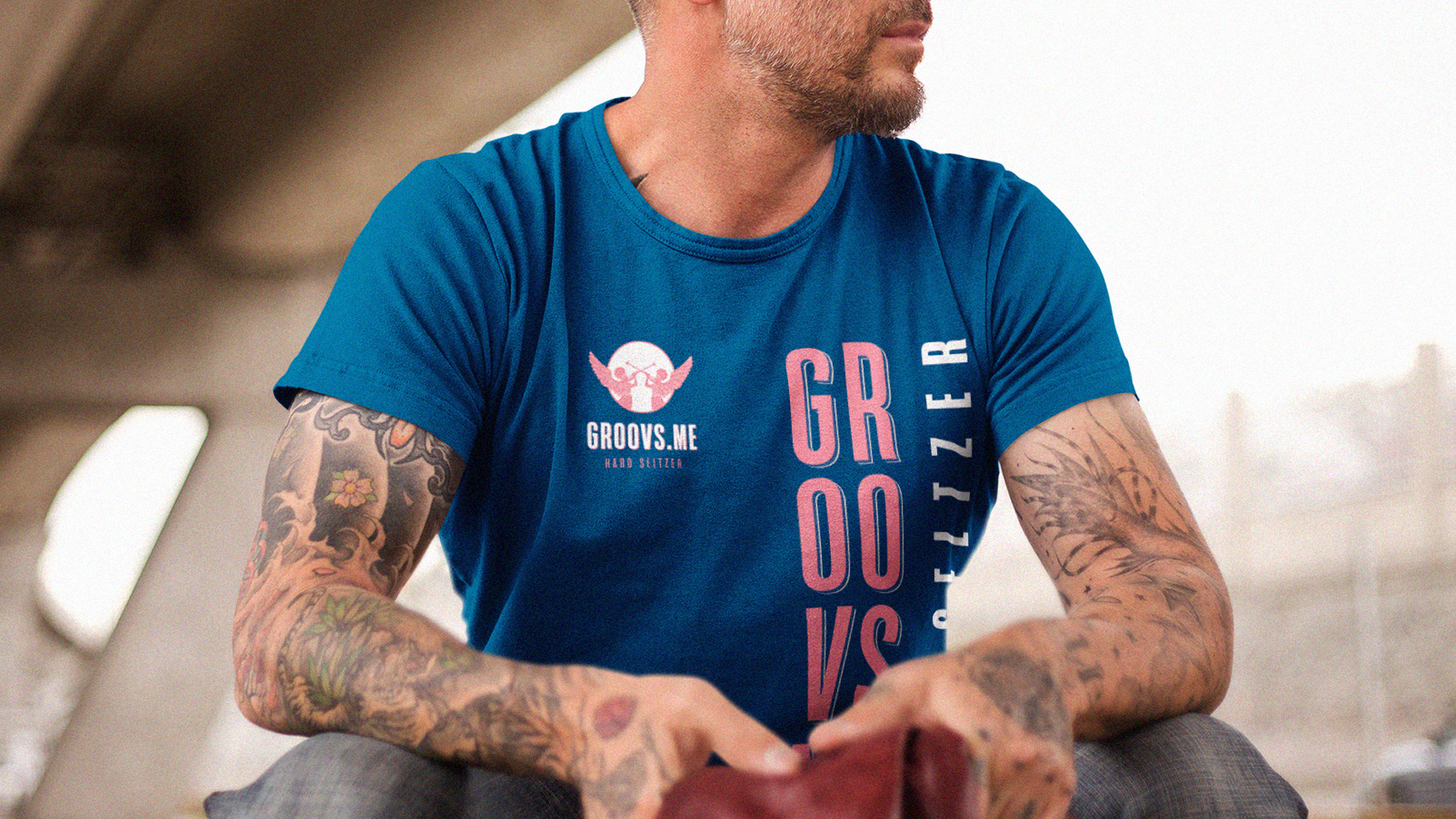
GROOVS.ME | HARD SELTZER
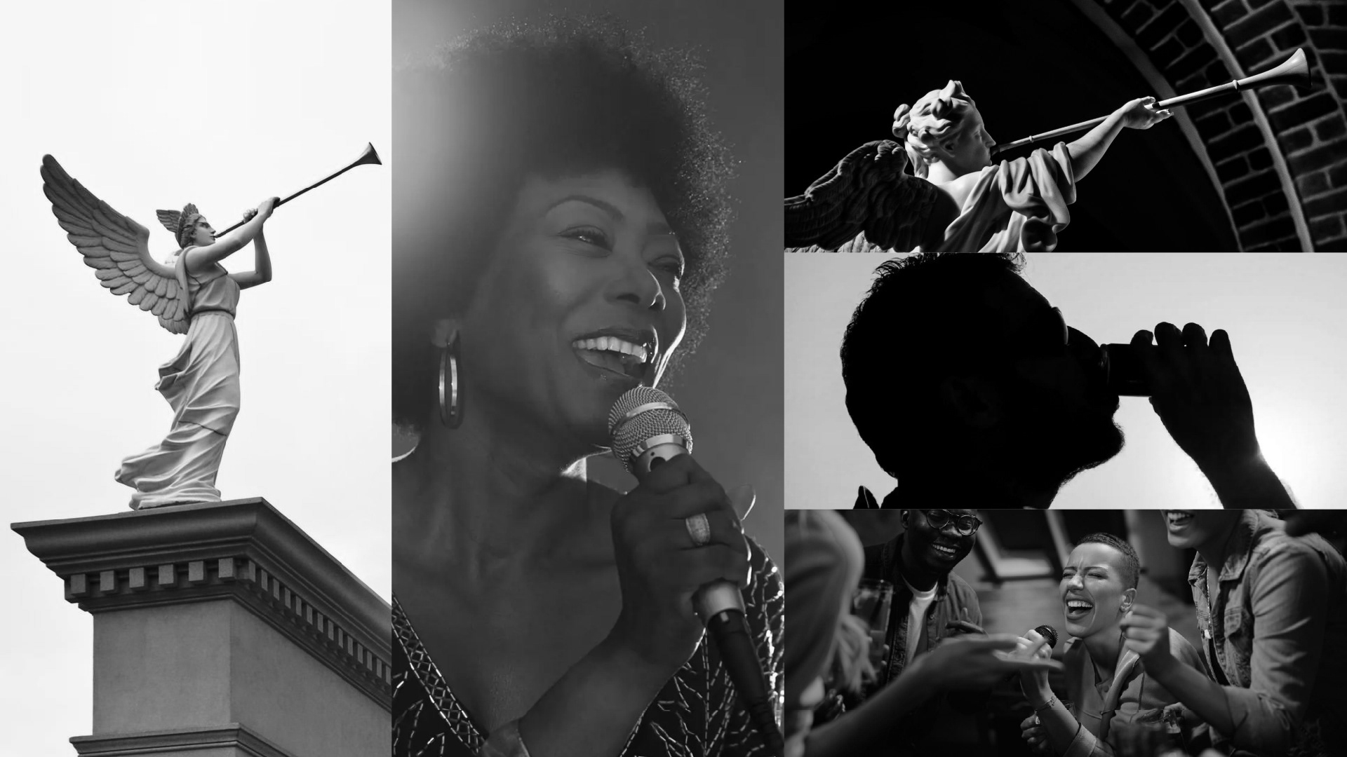
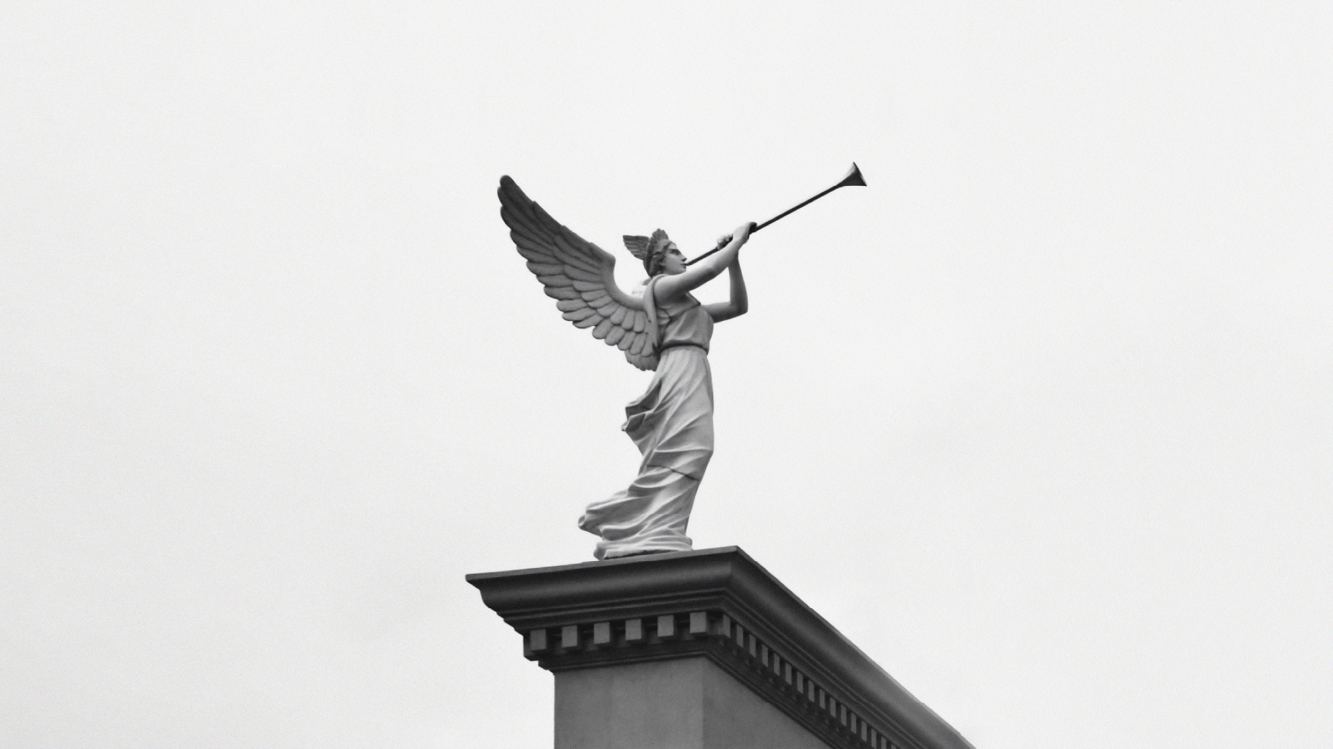
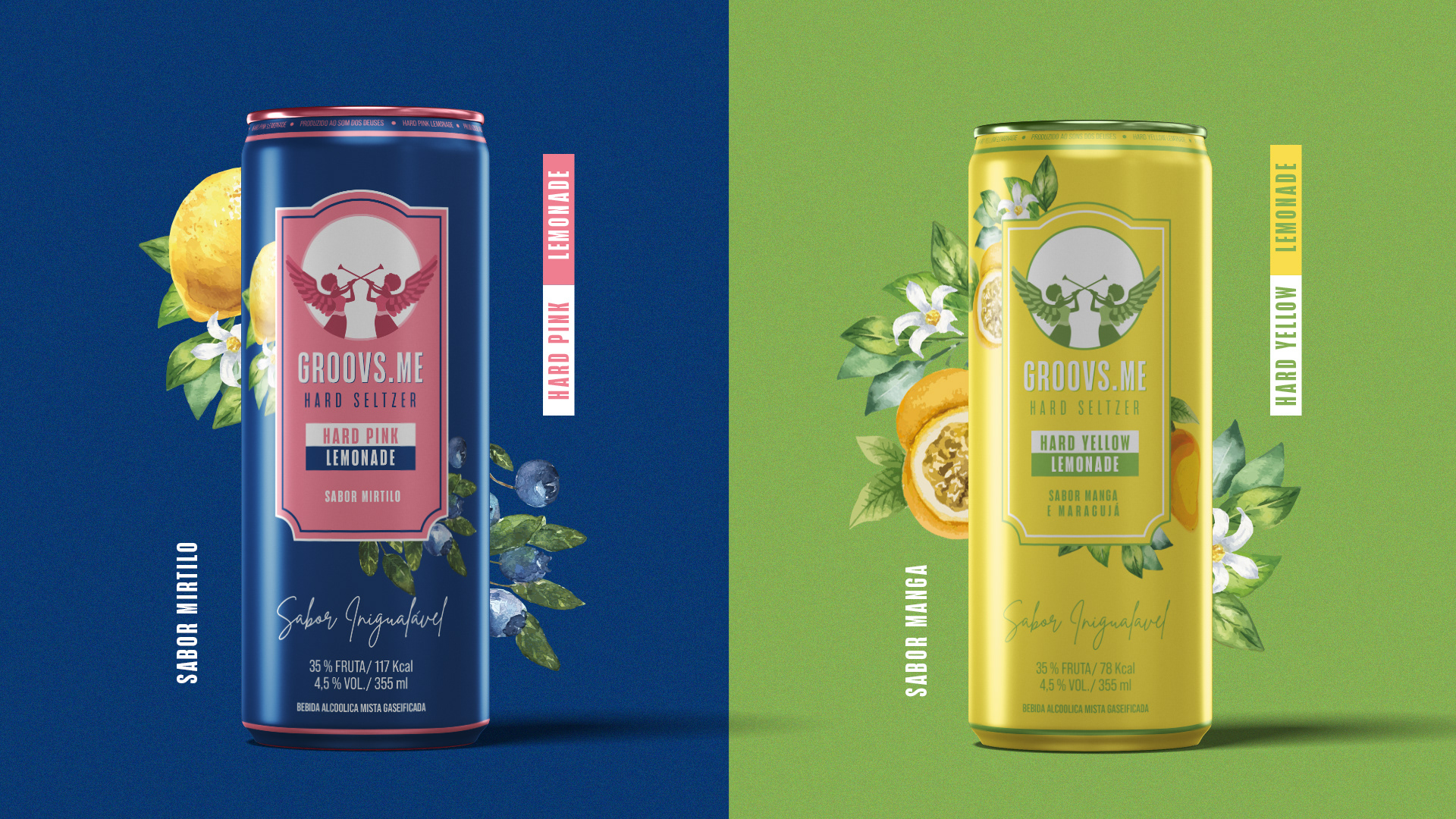
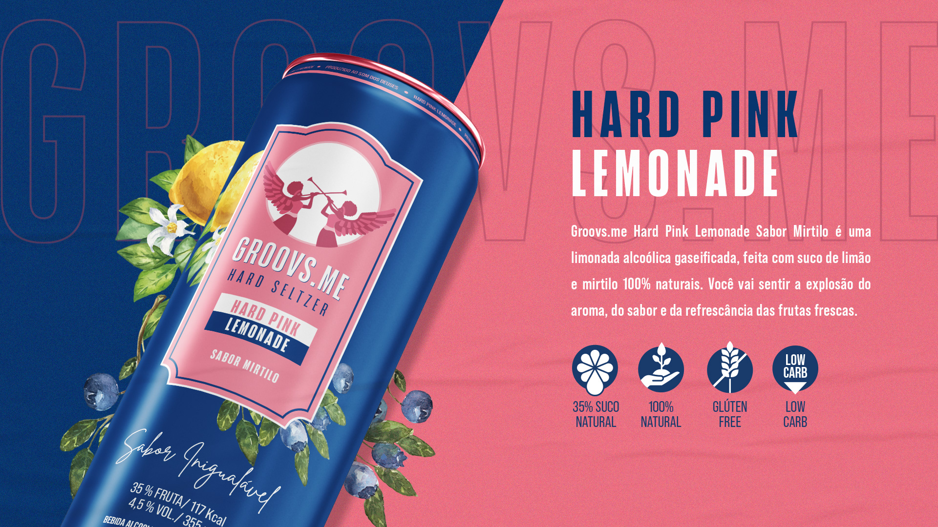
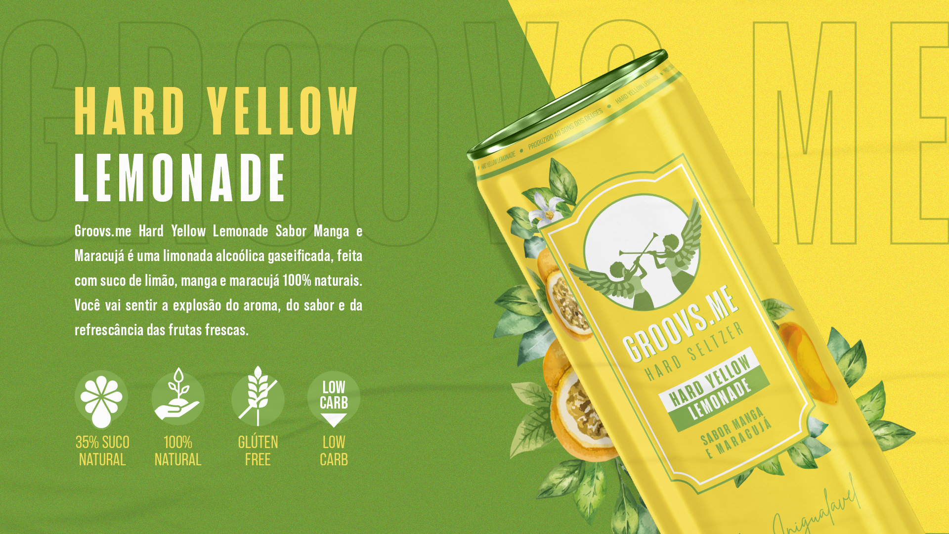
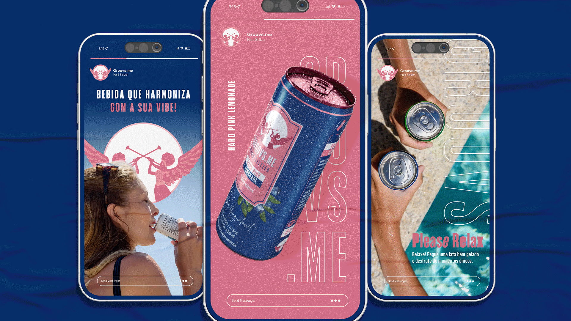
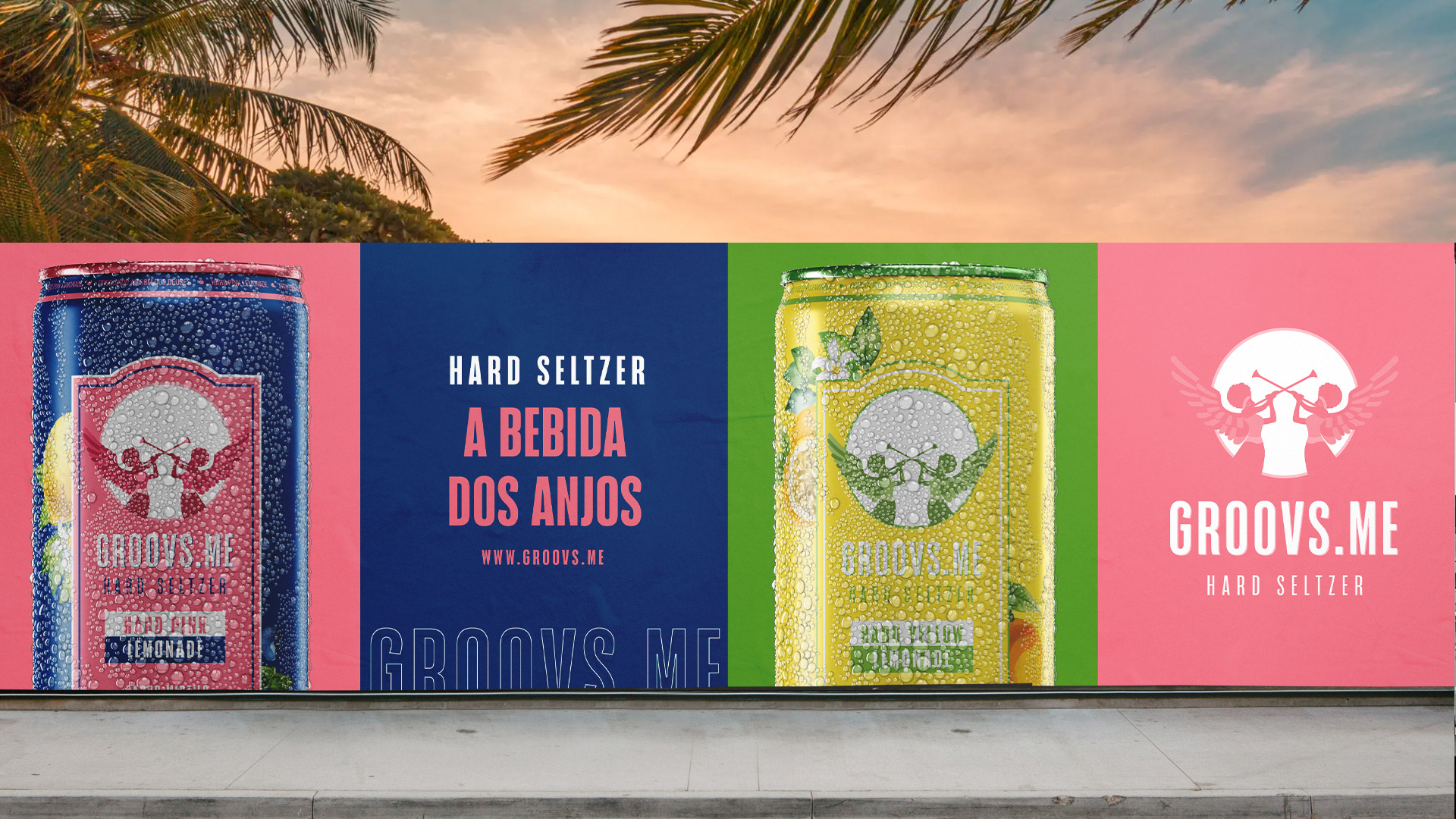
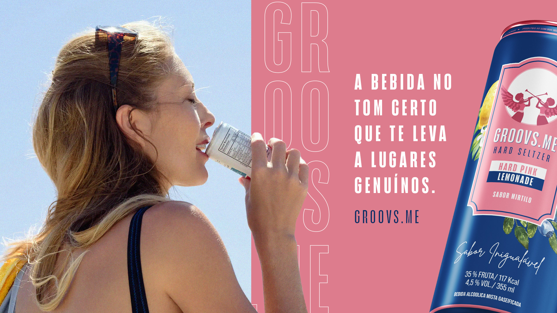
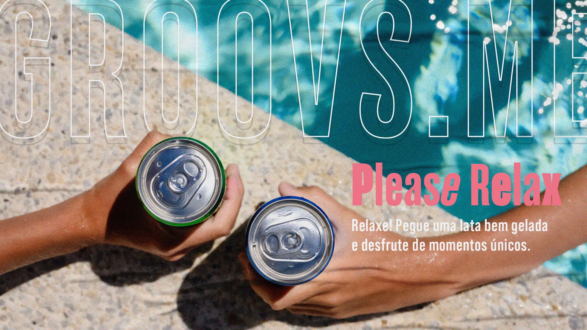
EN | Groovs.me is a brand of Hard Seltzer that embodies aesthetics and style at its core. Inspired by the artistic and human elements, the brand incorporates angelic elements into its form and essence. Moreover, it stimulates the senses and invites people to celebrate life. Groovs goes beyond being just a beverage; it's an invitation to embrace every moment of life with style and authenticity. Whether at a party, a casual gathering, or a moment of relaxation, Groovs evokes emotions and inspires a sense of lightness and ecstasy.
PT - BR | Groovs.me é uma marca de Hard Seltzer que personifica a estética e o estilo em sua essência. Inspirada pelo elemento artístico e humano, a marca incorpora elementos angelicais em sua forma e essência. Além disso, estimula os sentidos e convida as pessoas a celebrarem a vida. A Groovs vai além de ser apenas uma bebida, é um convite para aproveitar cada momento da vida com estilo e autenticidade. Seja em uma festa, em um encontro casual ou em um momento de descontração, a Groovs desperta emoções e inspira um sentimento de leveza e êxtase.


BUILDING THE BRAND:
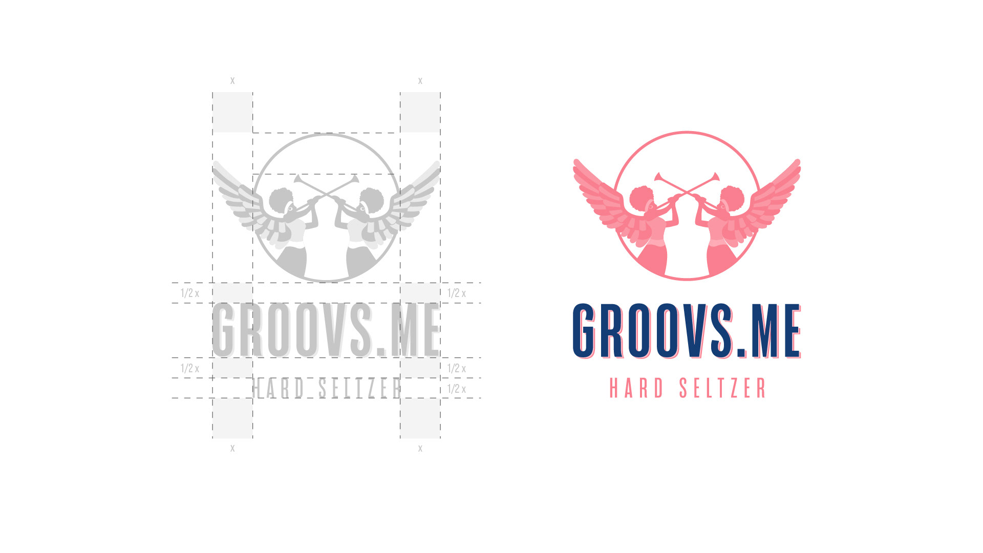
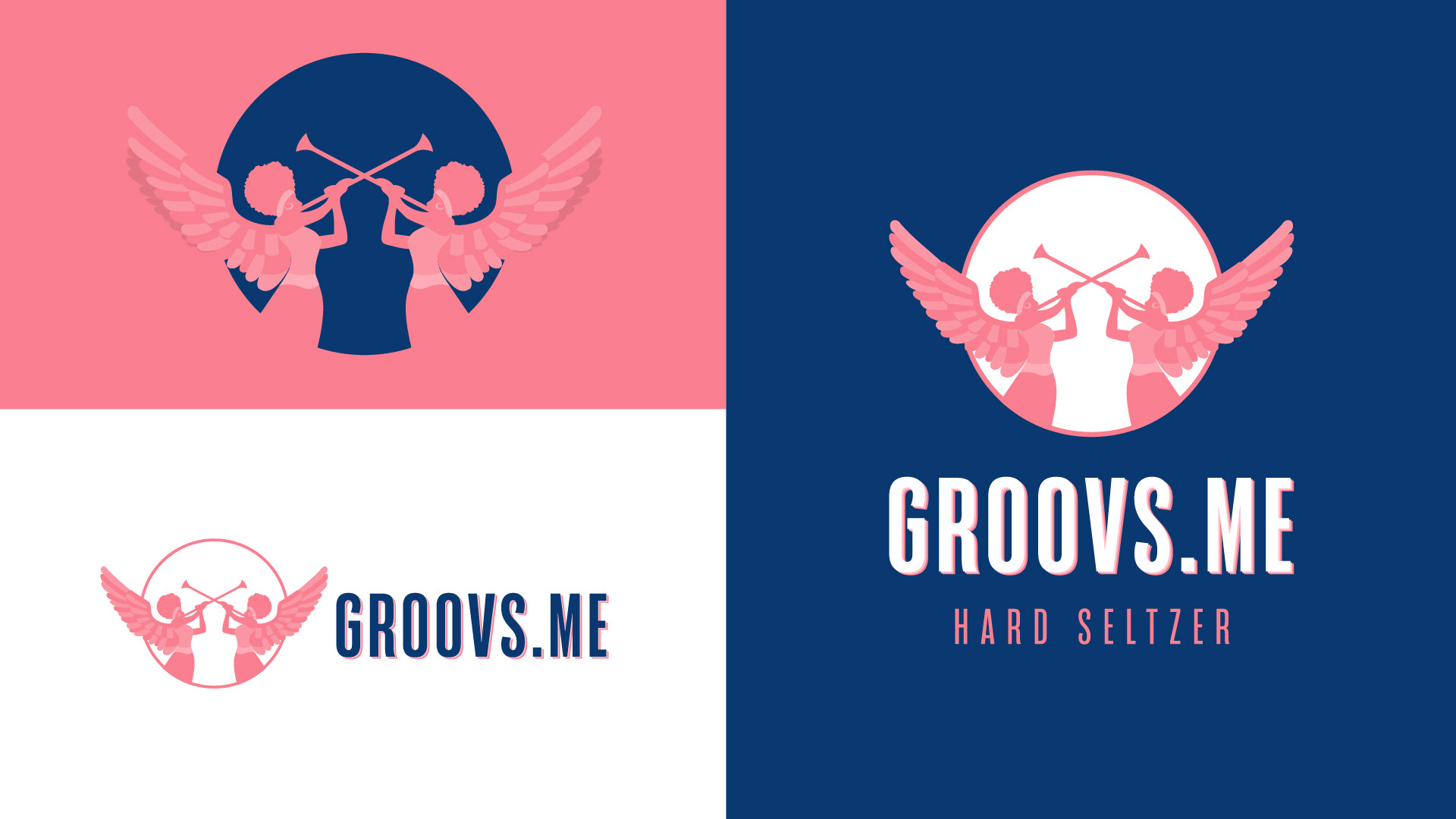
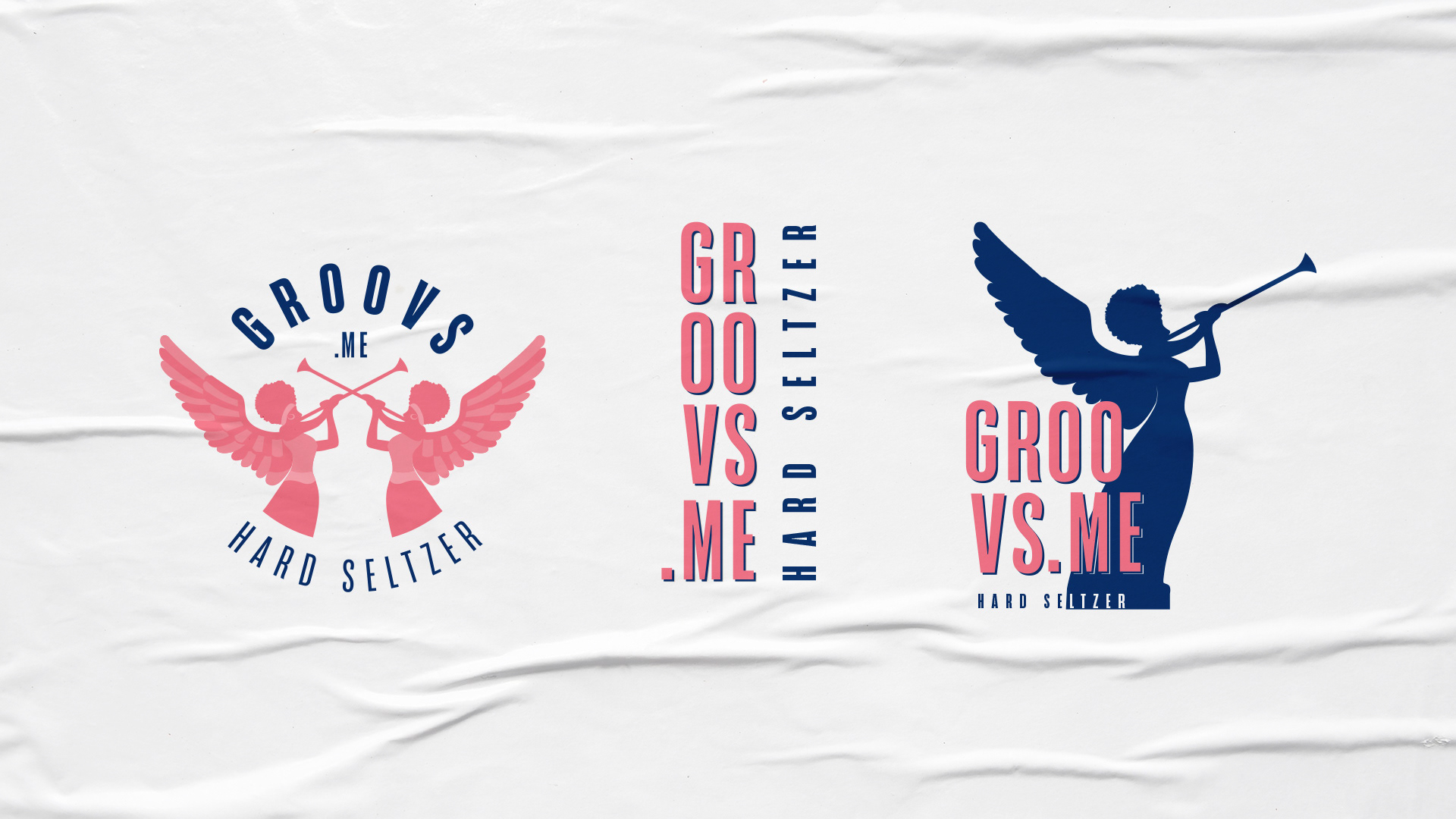
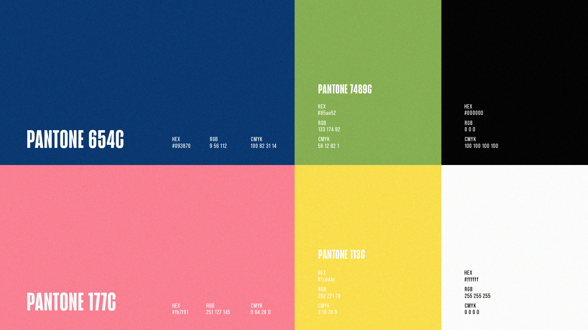
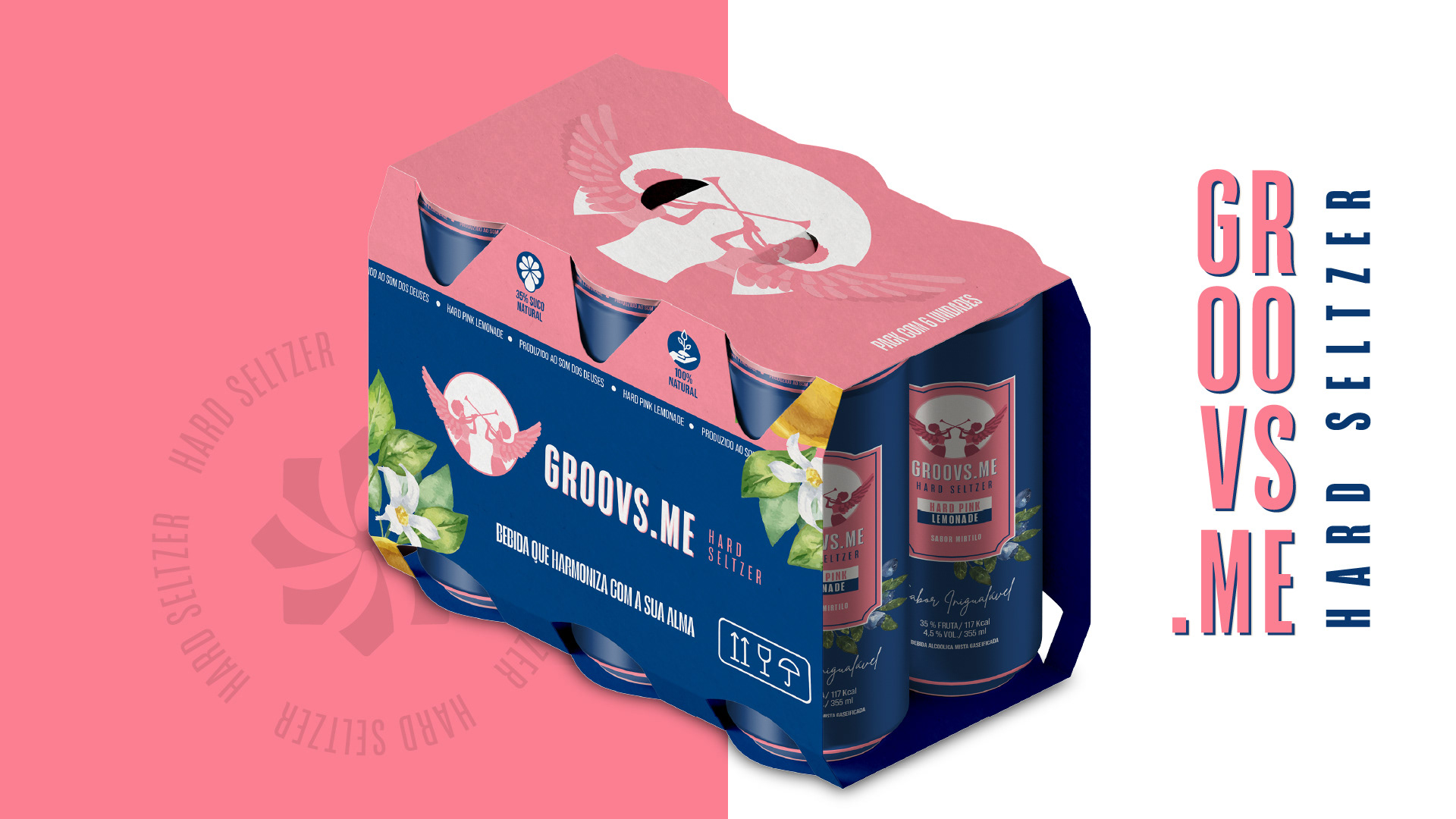
EN | The creation of the Groovs brand involved extensive research to find a representative figure, resulting in the choice of an angel. Brands with emblematic figures have a greater impact on consumers' minds. The challenge was to convey the essence of the business, highlighting the brand's unique features. Vibrant colors and shapes that reflect the feeling of the name itself were used for this purpose. The typography was chosen with the main point of contact in mind: the packaging.
The end result was a strong and memorable brand that connects with the brand's universe.
A CONSTRUÇÃO DA MARCA:
PT - BR | A criação da marca Groovs envolveu estudos profundos para encontrar uma figura representativa, resultando na escolha de um anjo. Marcas com figuras emblemáticas têm maior impacto na mente dos consumidores. O desafio era transmitir toda a essência do negócio, destacando os diferenciais da marca. Para isso, foram utilizadas cores vibrantes e formas que refletem o sentimento do próprio nome. A tipografia foi escolhida considerando o ponto de contato principal: a embalagem.
O resultado final foi uma marca forte e memorável, que se conecta com o universo da marca.

Projeto de Identidade Visual, 2022
Naming: Vinicius Prado
Design Direction: Mateus Müller